- Decorating
- Painting
How to Choose Paint Colors (Plus Mistakes)
Having trouble finding the right paint color for your space? Learn how to choose paint colors you’ll absolutely love, and the 8 biggest mistakes you’ll want to avoid!
You’re so excited to paint your space! You’ve been daydreaming about the end result and how much of a difference it will make. It’s going to feel updated, refreshed, inspired, and on-trend! But once the paint dries…you hate the way it looks.
You’ve got great style and you’ve got great taste. You know when to make a statement, and when to exercise restraint. (You always follow Coco Chanel’s advice of taking off 1 item of jewelry before leaving the house!) You understand that less is more. So how in the world did you get it so wrong??
Don’t worry, friend. We’ve all been there. Picking out paint colors can be REALLY tricky. It’s NOT common sense, so no matter how fashionable or artistic you are, you’re bound to get it wrong at least a time or two!
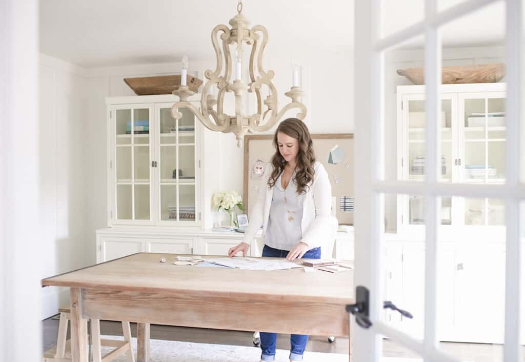
I’ve absolutely had my share of paint color disasters over the years. I’ve always loved soft and subtle wall colors, and in trying to achieve that goal, I for sure unintentionally painted my walls a robin’s egg blue, and a pepto bismol pink. Oopsie daisy! 😂

Luckily, I’ve been able to learn a lot from my mistakes, and now I have a steadfast handle on the tricks of the color scheme trade. Cracking the code on choosing paint colors became a focus for me. From studying the color wheel, to learning about LRV and neutral undertones, I’ve figured out how to choose paint colors, and I’ve got it down to a science!
Today we’re going to talk about the biggest mistakes to avoid when choosing paint colors, tips to getting it right, and what to do when you absolutely hate your new paint color! After we go through what not to do, I’ll give you the step-by-step formula for how to choose paint colors for your home successfully!
So set down the blue tape, and postpone your trip to the paint store, because these 8 paint color mistakes are nothing to brush over!
This post contains affiliate links, which means I may get a small commission (at no extra cost to you) if you shop my link. Please see my disclosure if you’d like more info!
8 Common Mistakes When Choosing Paint Colors
This post contains affiliate links, which means I may get a small commission (at no extra cost to you) if you shop my link. Please see my disclosure if you’d like more info!
Mistake 1: You Haven’t Decided on the Vibe You’re Going For
The truth is, different colors make us feel different ways.
You don’t have to be a color wheel expert, to understand the basic feelings that different colors evoke. Though the other elements in your room will create context, the basics give us a great starting point.
Bright, bold colors are stimulating and energizing, whereas soft muted tones are relaxing and soothing. Dark colors like black, navy, and deep olive feel moody or cozy, while light colors like white, yellow, and sky blue, feel fresh and lighthearted. Pastels tend to feel playful and young, while earth tones evoke a sense of groundedness and comfort. Of course there are exceptions to every rule, and sometimes that’s the fun of it – breaking the rules! But it’s good to have a general direction, at least, before getting started on your paint color journey.
Choosing paint color is all about the intention you set! All you have to do is decide how you want to feel when you’re in the room. What will you, your family, and guests be doing in this room? When you picture the room in use, what’s the ideal vibe? Loud and celebratory, or quiet and zen? Maybe the room needs the stimulation of interesting color to spark new ideas. Or, it might need the nondistracting environment of neutrals to promote focus and concentration. Is this where you’ll be going to unwind for the day in tranquil solitude, or is this a social gathering spot that you hope will play host to many echoing belly laughs and deep conversations?
Decide the intended vibe first and let it provide cues for your paint color.
Mistake 2: Ignoring the Big Picture
One mistake I see all the time is when someone is picking out paint color one room at a time, instead of creating a color palette for the whole house. When building, renovating, or repainting a home, I always advise picking out a whole house color palette. Yes, this may take a little more work on the front end, but I promise, your future self will thank you in the end!
Each room of your home will be used for a different purpose, so each will have its own personality. But there should be a design thread running through the entire home that ties everything together into one cohesive style. A whole house color palette will help provide this cohesiveness, and the colors will flow with ease from room to room.
As I’m sure you know, paint colors can be tricky. Some are warm colors, some are cool colors, and each neutral has different undertones that come out with certain lighting. Sticking to an intentional color palette you love, ensures no color wires get crossed, and helps the whole house design stay beautifully connected.
Should all my rooms be painted the same color?
I’ve seen many people paint all of their home’s interior white.
If you’ve found a neutral that you’re head-over-heels in love with, and you’re bringing in lots of colors and patterns via furniture, rugs, and accessories, then by all means, go for it. Done and done!
However, to achieve the style I love, I need a little more variability. And if you’re like me, and you love interior design, creating a color palette is so much fun!
When you curate a home color scheme, it will save you time, money, and stress. Because once you know what your color palette is, you’ll have less decisions to make throughout the painting process. Your paint color choices will be limited to a handful of paint colors, so you won’t be starting from scratch for every single room. I’m all for cutting down on decision fatigue, and this is a great way to do it!
Check out my step-by-step guide to creating your whole house color palette where I pull back the curtain on how designers use the color wheel, and give you a fail-proof path to deciding on a color palette that works for your home!
Can I use the same trim and ceiling color throughout my house?
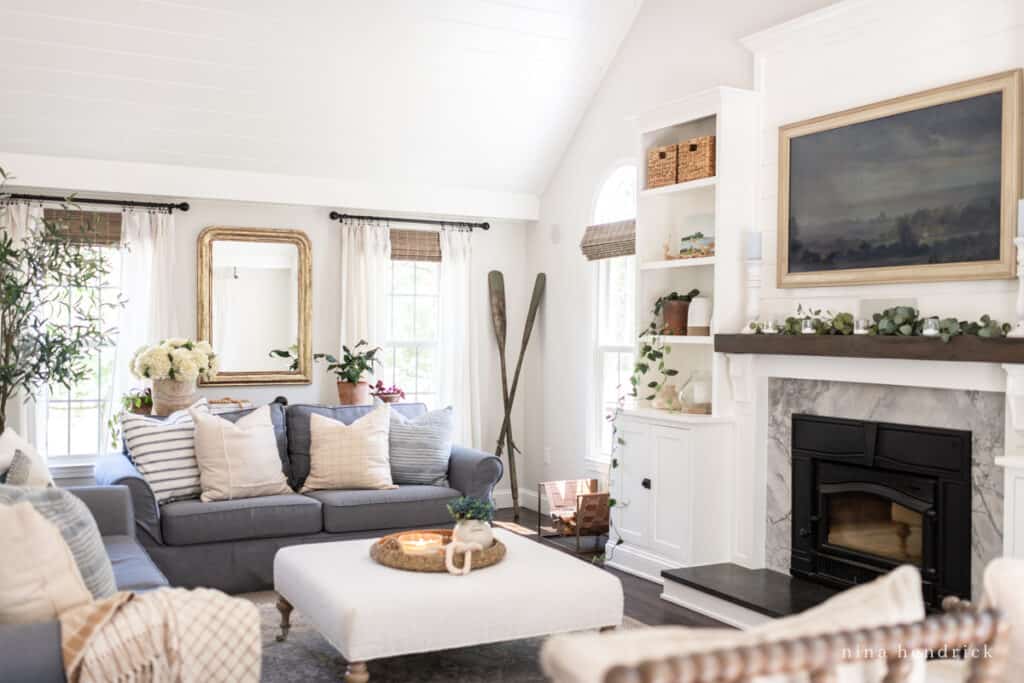
Yes, this is something I recommend doing. I am an advocate for having 1-2 signature “white” paint colors that you repeat through your home. The trim and ceiling don’t necessarily have to be the same color though, in our current home, all of our trim is the warmer Benjamin Moore White Dove and all of our ceilings are the cooler white Benjamin Moore Chantilly Lace.
It’s also important to note that a color will look different depending on the sheen you use. Our White Dove matte/eggshell walls look completely different than our White Dove semi-gloss trim.
You don’t just have to use white for trim, though. You can flip the script to keep things interesting. One of our neutral colors, Benjamin Moore Pale Oak, looks amazing in satin as a trim color with White Dove walls.
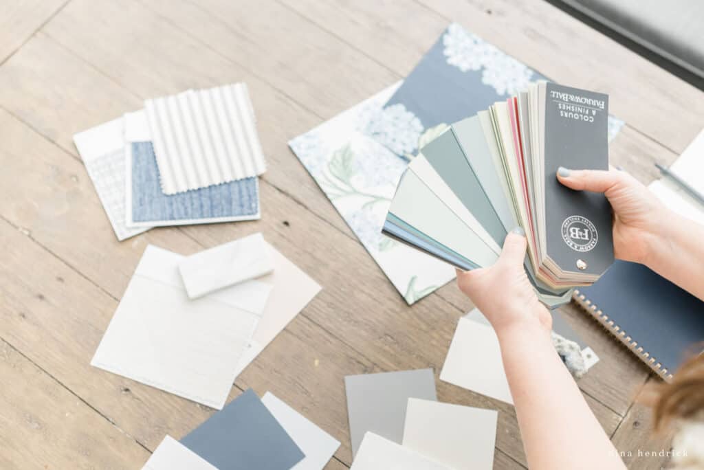
Mistake 3: Testing Color Swatches the Wrong Way
Why does my paint look like a different color?
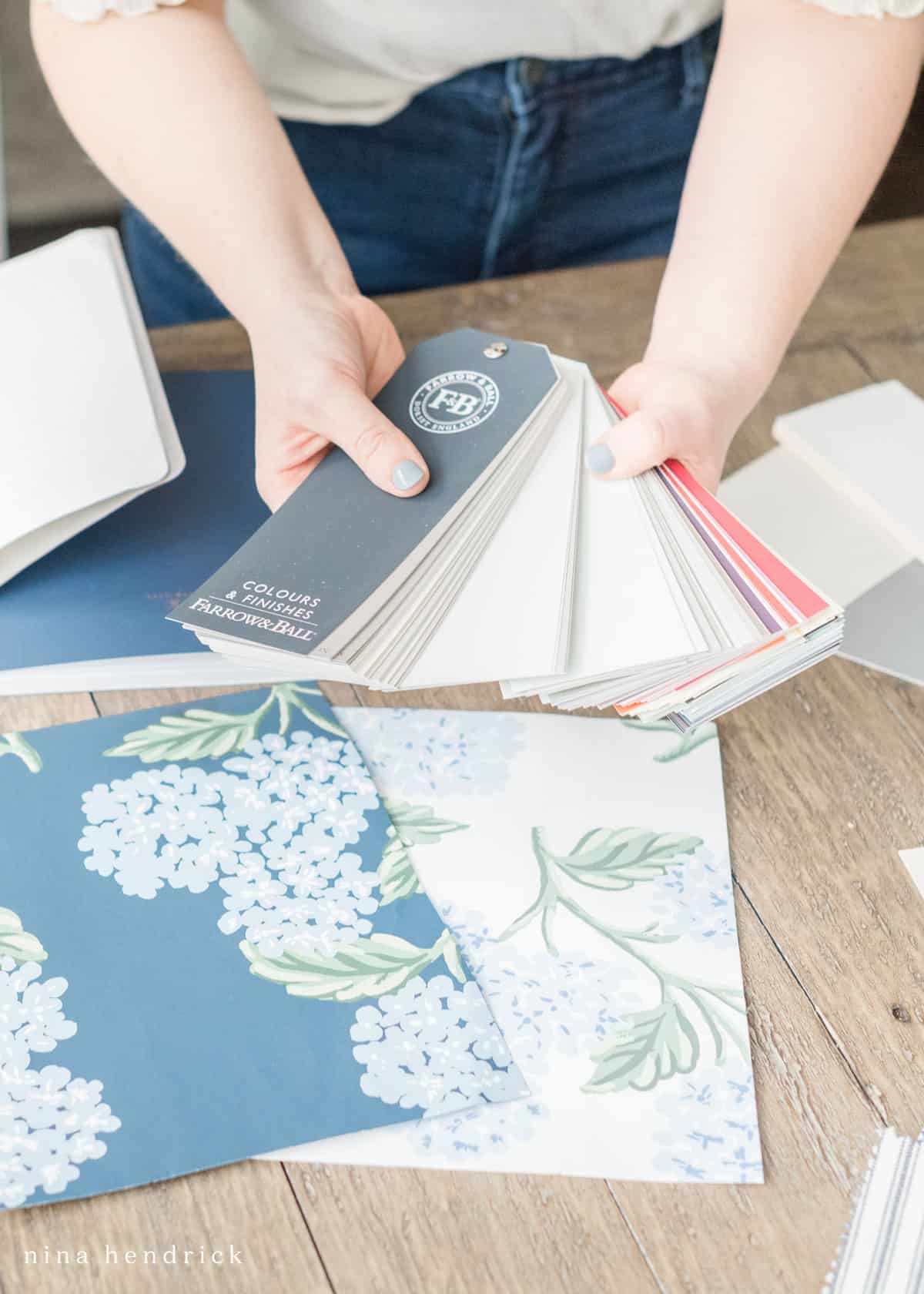
Ok, real talk. Who doesn’t love a good paint color chip, or 30, from the home improvement store?
I know I do!
They’re too much fun to play with for me to discourage anyone from using them. But, just don’t let your paint sampling stop there! In order to make sure you’re fully satisfied with the end result, you can’t pick out your paint colors solely by the paint chips from the paint aisle. Just use them as a starting point.
Once you’ve narrowed down your paint color options to about a handful, you’ll need to do some REAL color testing. You can do this in a couple different ways:
- Purchase peel-and-stick paint samples to stick on the wall
- Paint poster boards to be your test swatches and adhere them to the wall
Keep in mind that the peel-and-stick samples only come in eggshell finish.
Now you need to carefully observe for a couple of days! You’ll want to see how the colors look all throughout the day as the sun shifts, (actually as the earth shifts, but you know what I mean!), on cloudy days and on sunny days, as well as how they look at night with only indoor lighting.
You might have envisioned a dark and cozy beige for your family room, but when you see your swatch up on the wall, you realize the room’s lack of natural light makes the color look too muddy. Good thing you truly tested it out before painting the entire room… crisis averted!
Mistake 4: Not Considering Undertones
Each paint color has an undertone, and this has a big effect on how it looks in your space.
Have you ever been perplexed as to why one muted gray looks great paired with your furniture, and another muted gray does not? They’re both a soft neutral gray, so what’s the difference?? Well, it’s probably the undertones.
How do I pick the right paint color based on undertones?
A color’s undertone will reveal itself in different lighting, but I’ve also got a trick to figuring it out fast. This is where the samples from the paint aisle really come in handy!
A lot of those sample strips feature a color family of paint colors. Like an ombre effect, the darkest color will be at the bottom and each color will fade to a lighter and lighter shade as you go up the strip, with the lightest being at the top. If you’re like me, and you love browsing the neutrals at the tops of the sample strips, you can discover their undertones by looking at the darkest bottom color. The top color may be a white, and if you look down at the bottom of the strip and see a dark mustard yellow, you’ll know the top color’s undertones are yellow.
Undertones are a great tool for helping you decide which neutral would be best for your space, because you can use the general feeling that the undertones evoke as a guide.
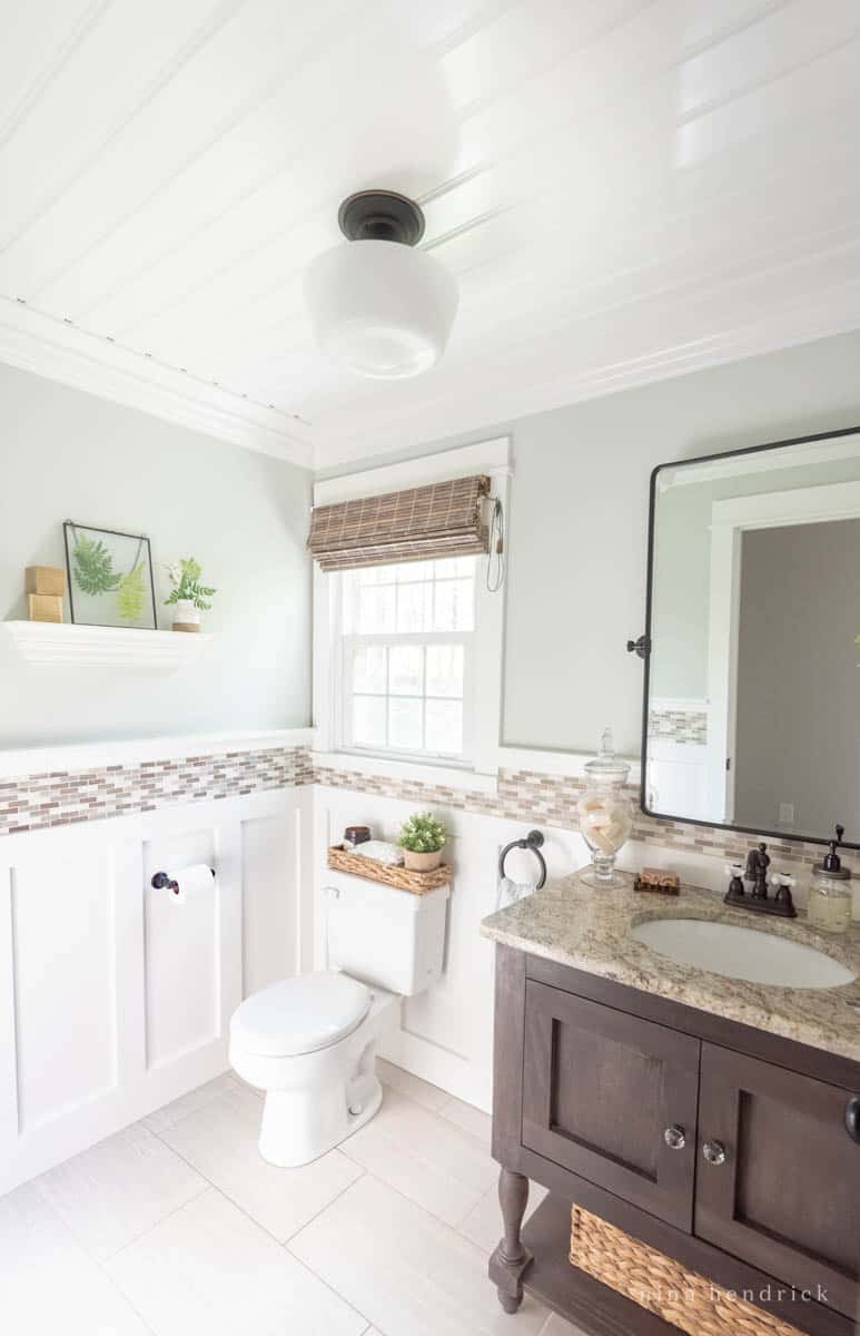
Needing a gray paint color for a spa-like atmosphere? Pick one with soothing aqua, blue, or green undertones, like I did for my powder room! If the room has a lot of natural light, the gray may look like a pale version of the undertone color at different times of the day. These calming cool colors will be sure to give your space the tranquility you’re wanting.
Another example: That white paint color you’ve been eyeing may have a lavender undertone. Once you discover this, you may decide that a white with a yellow undertone would be better for your space. Lavender is a cool color, while yellow is warm. This is how taking undertones into consideration will really aid in choosing the right color for your space.
If you’d like some specific examples of neutral paint colors and their undertones, check out my post on The Top 10 Best Neutral Paint Colors for Your Home. There I list the details of each color, and show you how each one looks on the walls of my home!
Mistake 5: Neglecting to Balance Out Fixed Finishes
When choosing paint colors, it’s important to make sure they balance out the fixed finishes of the room. What do I mean by fixed finishes? The permanent (unless you renovate!) design elements of the space. The flooring, the metal hardware, tile backsplashes, etc. These finishes have their own undertones that need to be considered before you decide on a wall color.
The main goal is to make sure you’re creating balance with the room’s paint color. Because the paint color becomes the backdrop for the whole room, it needs to properly showcase the fixed features. For optimum balance, pick a paint color that gives the room what it is needing.
If you have a room containing lots of warm wood finishes, a soft gray neutral paint with blue undertones would cool things off nicely. A room with white tile and chrome metal hardware (which both contain cool undertones), might achieve its balance with a warm mushroom neutral paint with beige undertones, to keep things inviting and cozy.
Mistake 6: Ignoring the Direction Your Room Faces
Did you know that paint colors can look completely different depending on the cardinal direction that your room faces? That’s right, the exact same paint color can look different within your home in two different rooms. Now, if you’re like me when I learned that information, it was like a lightbulb went off! I thought that once I found a paint color I loved, I could rinse and repeat, and then I’d be so disappointed when I didn’t like the results of the color. Now I know that the way light comes into the room plays a big impact on color.
Directional Exposure is the primary direction your windows face. You may have multiple directional
exposures. Your paint colors are impacted depending on whether your room face north, south, east,
or west. To determine this, stand facing your windows holding your compass (or your smart phone,
which probably has a compass app). The direction your needle points determines your exposure.
Multi-Directional Exposure is if you have more than one exposure and one is noticeably more dominant than the other(s)- i.e. you have four windows on one wall and just one on the other- than that will be your exposure. If you have three or more, there’s a very good chance that one stands out as the dominant exposure.
Otherwise, you can follow the chart below to decide which one you should use. The primary bedroom in our previous home is an example of a room that had multiple exposures and none stood out as the most
dominant. It had three walls of windows that let in bright sunlight.
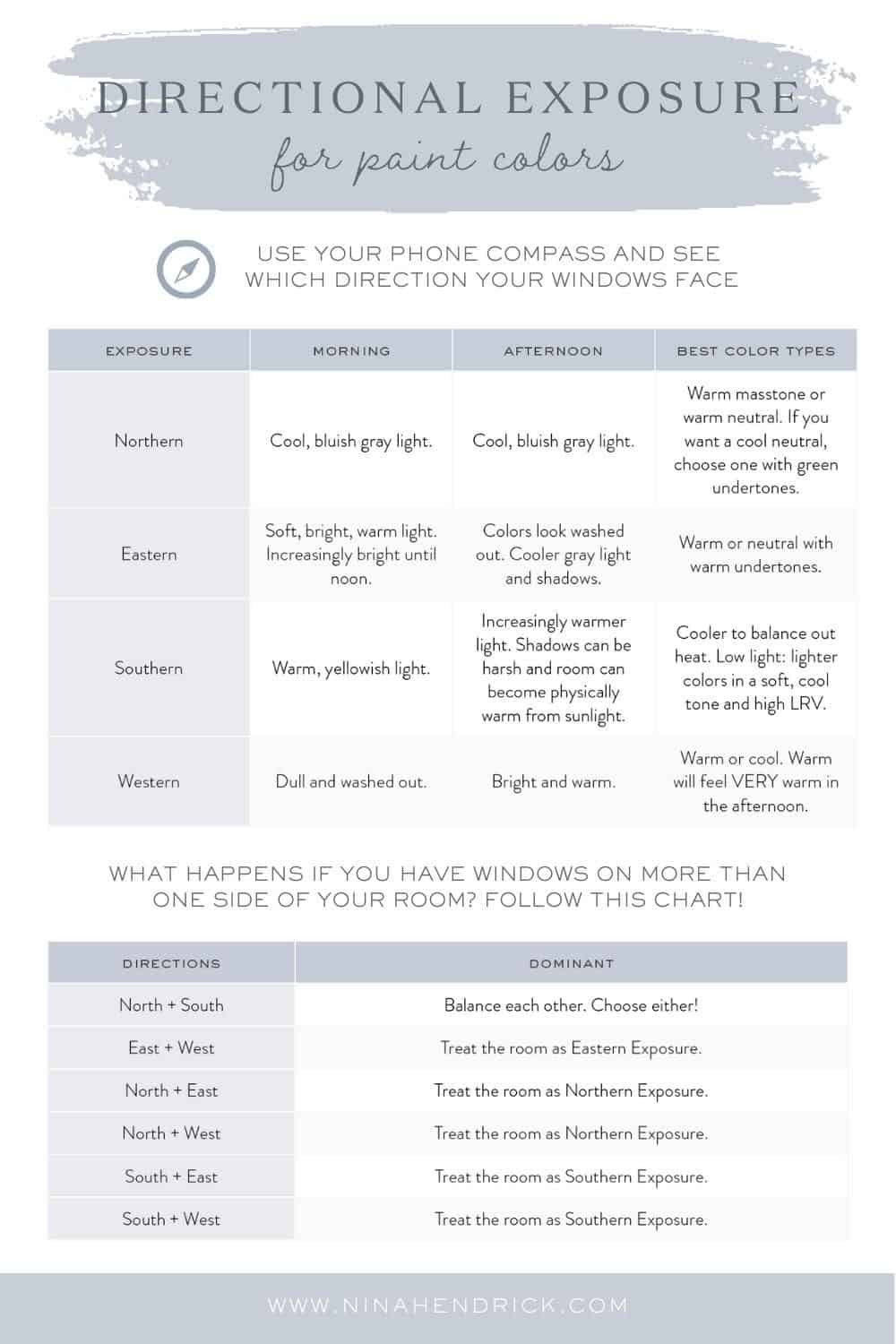
Now that you’re equipped with this info, you can begin searching for paint color inspiration that includes which direction the room is facing in the photo!
Mistake 7: Picking a Color That’s Too Bold or Too Dark
When I was experimenting with painting for the first time, I used to always choose a shade too dark. This is a classic, rookie mistake! (That I ended up making many times over, haha.)
Now I mostly work with soft, muted neutrals, but I’ve definitely had my fair share of paint color mistakes, particularly when I used to gravitate towards more saturated colors.
I quickly learned to always choose 1-2 shades lighter than what you think you need! There’s a couple of reasons for this.
- Paint color samples are deceiving! A bold or bright color is a lot more overwhelming to the room when it’s covering the walls around you, than in one tiny paint sample that fits in the palm of your hand.
- Paint changes color as it changes form. There’s the way it looks on the sample, the way it looks wet in the can, and the way it looks dry on your walls. The color dry on your walls will always be the darkest. And sometimes this is darker than what you had in mind. It’s amazing how just a hint darker can be a totally different look!
So is it better to go lighter or darker with paint?
Whether you choose a light or a dark paint color will come down to personal preference. Sometimes the goal is a dark moody color. They’re definitely a part of some decor styles that are currently trending. But even with these colors, I still suggest going a shade or two lighter than you think.
Used to, the design advice was always to avoid dark colors because they would make your rooms look smaller. But that has since evolved. Now people see that dark colors have the ability to bring groundedness, comfort, elegance, or glamor. And even in smaller spaces, sometimes this is exactly what is needed.
What colors make a room look bigger and brighter?
If you’re needing to brighten up a space where natural light is low, there are definitely certain paint colors that can help you to achieve that. The main thing to pay attention to is the color’s LRV.
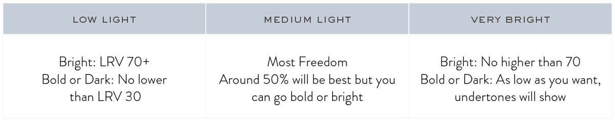
LRV stands for Light Reflective Value. Each paint color’s LRV is on a number scale from 0-100. The higher the number, the more light the color bounces around the room. This makes the room look brighter. The lower the LRV, the less that color will reflect light around the room. This will make the space look darker, because instead of bouncing light around the room, the darker color will absorb it.
A super easy way to remember it: Black has 0 LRV, and white has 100 LRV.
So if you want to make a small room feel bigger and brighter, choose a color with a higher LRV. Throw a good size mirror into the decor mix, and the light will bounce more than your kid’s latest party favor bouncy ball!
Mistake 8: Matching Your Wall Paint Color with the Room’s Statement Fabric
At first instinct, we think we need to find a paint that is an exact match to our room’s statement fabric color. While you can certainly use the color as a jumping off point, I’ve learned that trying to get an exact match (or worse, using a “color match app”) never achieves the look I’m going for. Now, it’s second nature for me to go several shades lighter.
Whenever you have a saturated color or statement fabric in the room, whether it be the bedding, couch pillows, or accent chairs, and you’d like your wall color to coordinate, stay with the same paint color tone, but go several shades lighter.
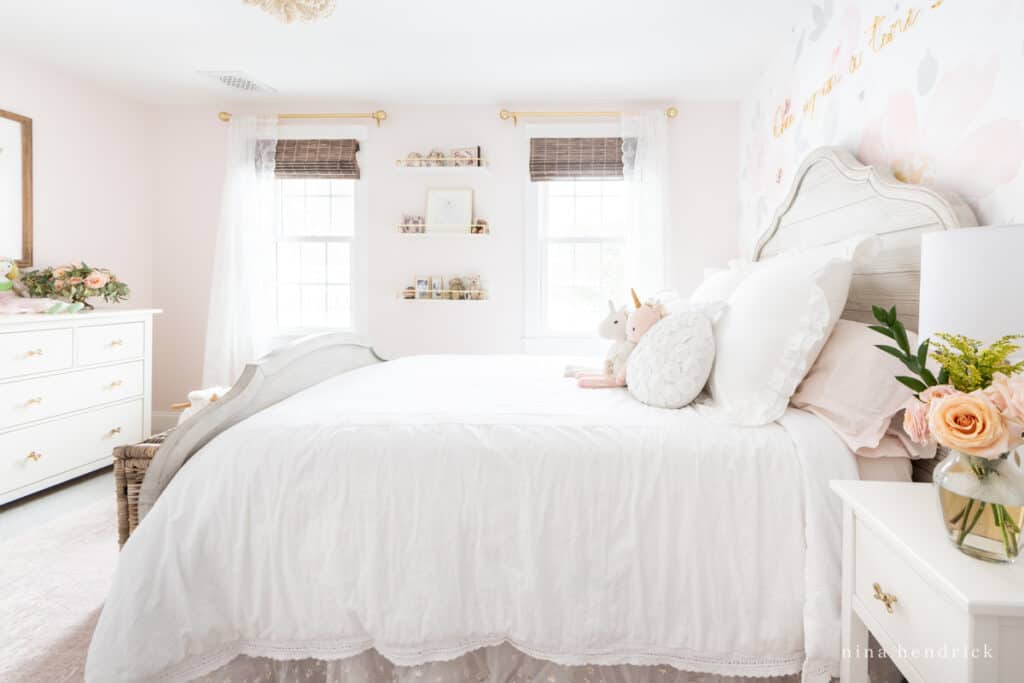
Let’s say you have a little girl’s bedroom with light pink bedding, and you’re wanting pink on the walls as well. You’d want to pick a pink paint color that was several shades lighter than the bedding, but in the same family. A faint muted pink with a light and airy feel will provide the perfect backdrop that lets the bedding stay the star of the show. Softly muted, barely there wall colors give a refined look that I love!
When and How to Lighten Paint Color
Sometimes, even after analyzing and testing colors, we still get it wrong. And that’s ok! My go-to trick for correcting a paint color that I feel is sooo close to being right, but not quite there yet, is to have the paint store lighten the color by 50%. To accomplish this, you simply go up to the paint counter and ask them to lighten the color by 50% (or 25% if you’re just looking for just a smidge lighter). This is not the same thing as adding white to a paint color, they actually change the color formula to be at a different strength. Many times over, this has been the key to getting the result I wanted! The just paint needed less color saturation. I come back, repaint, and boom… my perfect color.
How to Choose Paint Colors (Correctly)
To recap, now that we’ve thoroughly established what not to do when choosing paint colors, let’s flip that around and I’ll give you my simple formula for how to choose paint colors successfully!
- Determine the mood you want for your room.
- Take note of your fixed finishes and lighting.
- Begin looking for inspiration. Just remember that things don’t always look the same on the internet as they will in your home. Check the section on directional exposure for more details!
- After determining which colors you want to try, make sure that they make sense with the overall color scheme of your home.
- Test your samples by creating paint swatches on poster board (leaving a white border) or by ordering peel-and-stick samples. Make sure to observe these in different light conditions, different times of day, and in different weather.
What to Do When You Hate Your New Paint Color
Even with all of these considerations, it still happens! While it can feel frustrating, paint is still one of the ways you can make a huge difference in your home inexpensively and quickly.
A lot of times when we really despise our new paint color, it’s because of the way that color is making the space feel to us. The vibe it’s creating in the room is going against the vibe we want.
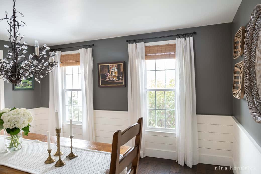
Color psychology is ultimately subjective, and it’s also dependent on the hue, shade, or tint of the color. To some people, a dark charcoal gray feels sharp, dramatic, and moody. But when I painted my dining room this color, I felt that it was relaxing, comforting, and cozy in that space!
Zoom in on the color that’s bugging you, and get to the bottom of why it’s having that effect. Since color psychology is in the eye of the beholder, trust your own opinion on it. Name what you don’t like about it, and then name how you WANT your color to feel. This will help you head in a paint color direction that better suits your needs.
Need more help figuring out the types of paint colors you DO love?
I hope this blog helps you learn from my paint color mistakes, so you can skip right to getting the paint color of your dreams! You can find me on Instagram, where you’ll find more pics of my home and our recent renovations, and a saved story highlight of my favorite paint colors!
