Our Paint Colors
This guide of the top 10 best neutral paint colors will help you find the perfect shade for any room in your home!
Are you looking for the perfect neutral paint colors to use in your home? Look no further! We’ve compiled a comprehensive guide of 10 of the best tried-and-true neutral paint colors, complete with real-life photos of actual rooms. No matter the undertones or lighting situation, these shades of whites, creams, beige, and greige are sure to bring your space to life!
In the past, we’ve shared how to paint a room, our favorite room painting essentials, and how to choose a cohesive whole house color palette (like the one in this post) step-by-step. Today, I’m going to share all of the details about the best neutral paint colors and show you real-life examples in my home.
How to Choose Neutral Paint Colors
When choosing neutral paint colors for your home, it’s important to consider the overall feel and atmosphere you want to create. You’ll want to select colors that work well with the existing decor and furniture in your home, but also colors that will help create the desired ambiance.
- If you want a room that is calming and peaceful, select a color like pale gray, beige, or cream.
- If you want a more modern and contemporary look, use shades of off-white or gray.
- To add a bit of warmth, choose a shade of mushroom or greige.
- If you want a more dramatic look, go with a deep, dark brown or charcoal gray.
Neutral paint colors are a great choice for most rooms, as they won’t clash with existing decor and can be used to create a cozy, inviting atmosphere.
Like I talked about in the whole house color palette post, a typical paint color scheme includes 3-5 predominant colors. Of course, there are also accent colors and finishes, but today we’re focused on the key event: the primary paint colors.
Below is a breakdown of my favorite neutral paint colors with the characteristics of each color!
This post contains affiliate links, which means I may get a small commission (at no extra cost to you) if you shop my link. Please see my disclosure if you’d like more info!
What’s LRV?
Light Reflectance Value (LRV) is a scale from 0 to 100 that measures how much or how little light a paint color will reflect when illuminated by a light source. 0 is black and absorbs light and 100 is white with the maximum reflection.
Simply put, with a neutral you want that number somewhere in the middle, taking into consideration the amount of natural light in your space. Most of the colors in this palette fall in the middle-high 60-70 LRV range.
The Top 10 Best Neutral Paint Colors
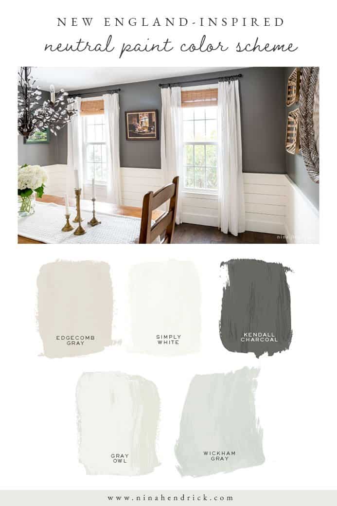
When it came to choosing colors for our New England Colonial, many of these came from Benjamin Moore’s Historical Colors Collection. Not only are they gorgeous and timeless colors, but they were pulled from historical American architecture and landmarks. Nerd alert: this played a pretty big part in my choices. You can read about how my decorating style has been influenced by the heritage of New England here and how I’m a 30-something “Coastal Grandmother” here.
Beyond their fun history, these neutral paint colors are a great choices for adding a subtle touch of color to a room without overwhelming the space. Neutral toned walls allow you to mix and match other colors and patterns to create a unique look that can be changed easily over time. They’re also ideal for creating a relaxing atmosphere in a room, as they provide a calming backdrop for furniture and decor.
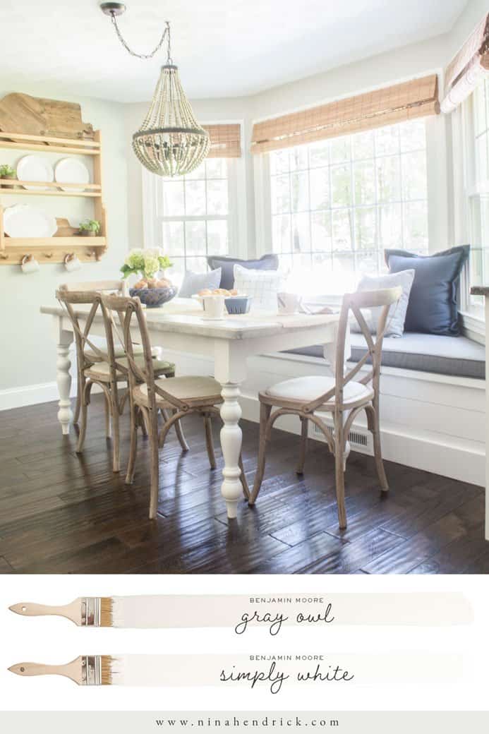
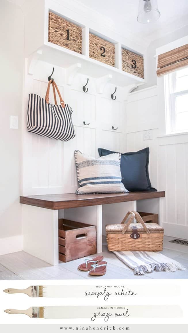
1. Benjamin Moore Gray Owl 2137-60
LRV: 65.77
Gray Owl is my all-time favorite gray paint color. It has a subtle blue-green undertone. It pairs really well with creamy whites such as Simply White.
In our breakfast nook, this color paired perfectly with the Simply White painted bench and trim.
We also carried Gray Owl all of the way through our kitchen and down the hall to our mudroom.
In 2019, when we embarked on a full kitchen renovation, I still loved the Gray Owl so much that we kept it. Although our cabinet company, Shiloh, didn’t offer Benjamin Moore colors, we went with their Polar White color for a close match to Simply White. It works perfectly with Gray Owl!
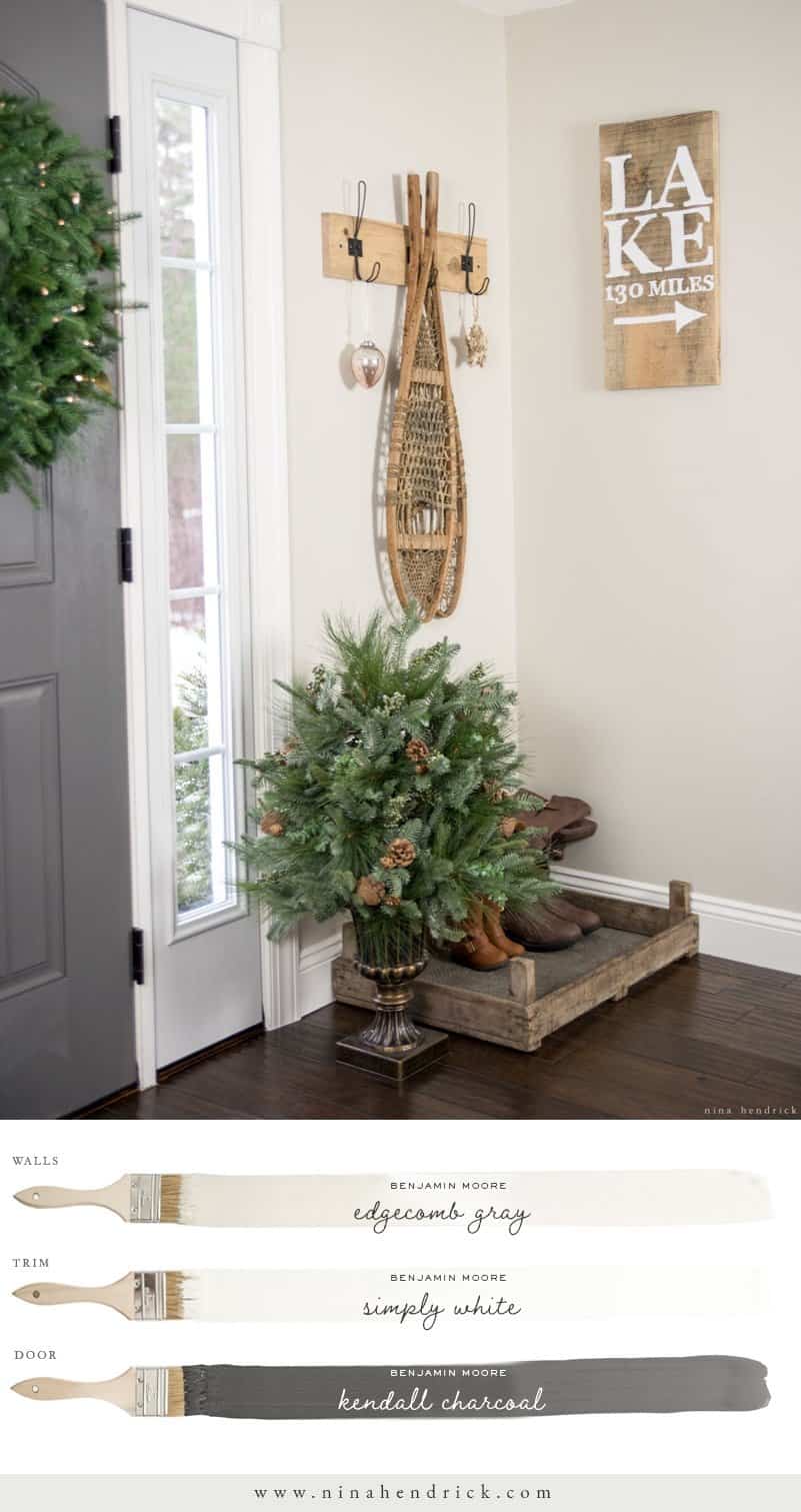
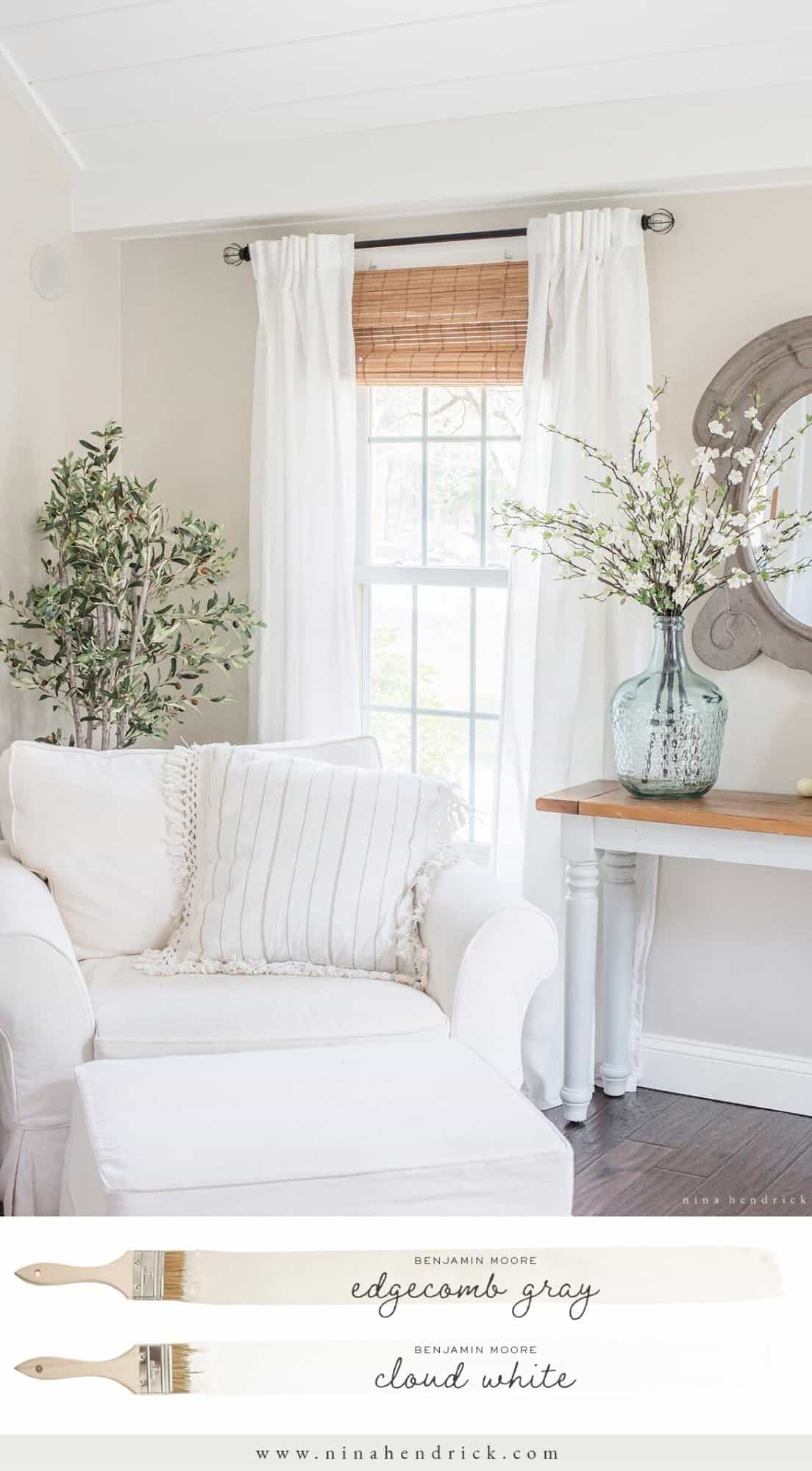
2. Benjamin Moore Edgecomb Gray HC-173
LRV: 63.88
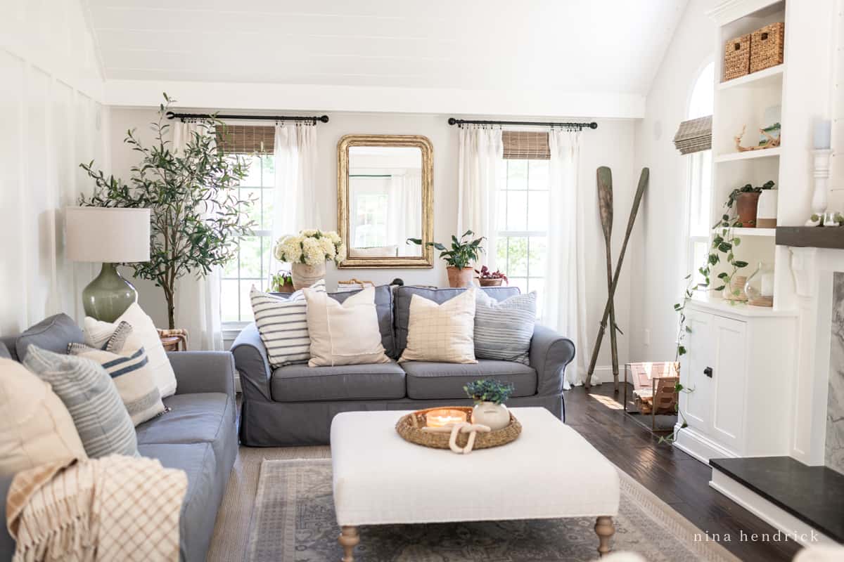
Benjamin Moore’s Edgecomb Gray HC-173 in eggshell is the color that is currently most prominent in our home (although I’ve lightened it by 50% before to raise the LRV, see below). I consider it the ultimate greige and I honestly could never tell you whether it’s truly gray or beige.
The family room and foyer are painted this color, and then it goes up the stairs and into the upstairs hall (which are all connected).
It can have slight reddish or greenish undertones in certain low-light situations, so always make sure to properly test paint colors by using an adhesive sample. Overall, it’s one of the most neutral paint colors I’ve ever worked with.
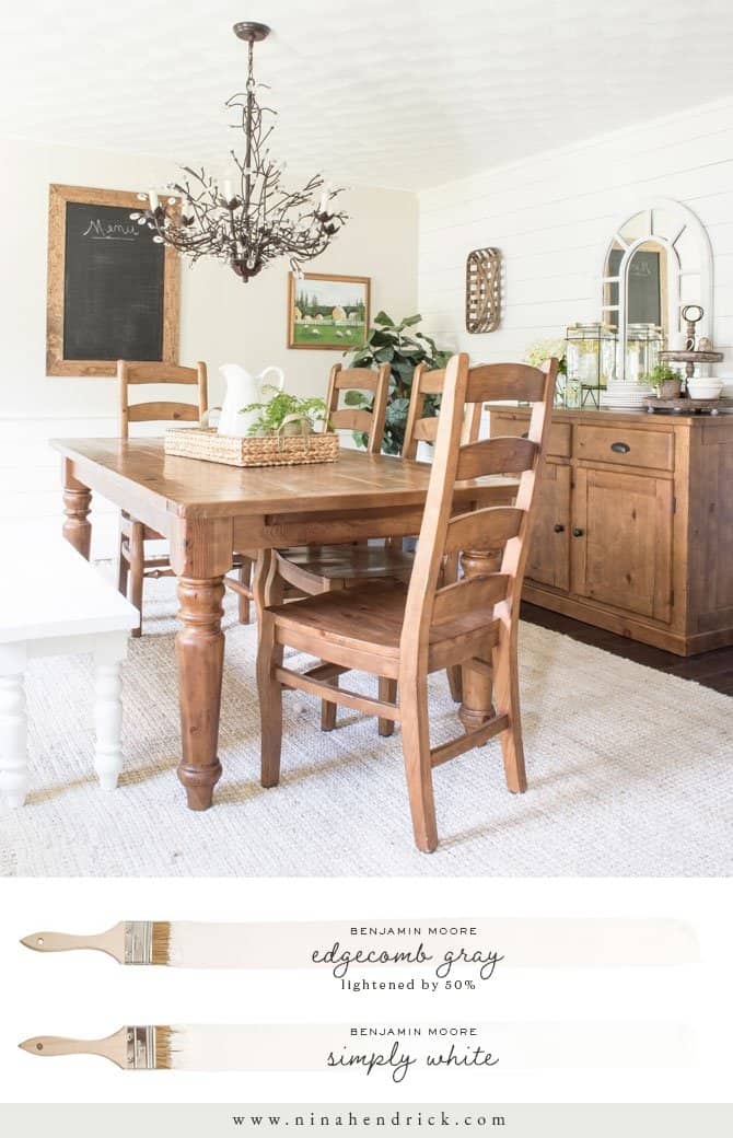
3. Edgecomb Gray Lightened by 50%
LRV: Approx. 70
why/when do you lighten paint colors?
I’ve chosen to lighten paint colors by 50% in rooms that have very little natural light in order to raise the LRV of the color by 8-10 points. Please do remember that this isn’t the same as tinting the color (adding white). This changes the overall color formula and should be treated — and tested — as its own color with unique undertones.
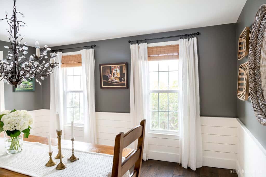
Our Dining Room is an example of a darker room where I lightened Edgecomb Gray by 50%. Eventually, I embraced the moodiness and went for a high-contrast look (see Kendall Charcoal below).
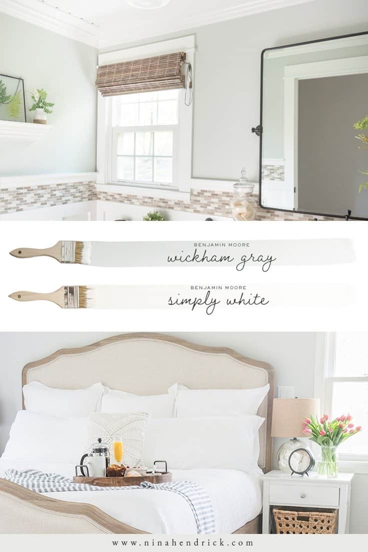
4. Benjamin Moore Wickham Gray HC-171
LRV: 68.94
Wickham Gray is one of my ultimate favorite paint colors. Like Gray Owl, it has some green undertones, and can in fact actually appear aqua in certain lighting situations. It can be cheerful and calming as these color shifts happen, and no matter what, it’s such a clean color.
The powder room was our very first project in this house, back in 2012. We ended up painting it Benjamin Moore’s Wickham Gray HC-171 in eggshell.
Before our primary bedroom makeover, the room was Wickham Gray for many years. After we covered up the north-facing window in favor of a better layout, the color really shifted. We swapped it out for something with fewer undertones (and I’ll go into that more later in the post)!
5. Benjamin Moore Simply White OC-117
LRV: 91.7
Simply White has an ever-so-slightly cream undertone, although it’s still pretty light as far as whites go. This provides a contrasting warmth to the cooler tones of Gray Owl and Wickham Gray. It perfectly complements the warmer Edgecomb Gray.
This is the primary “light” color in our home. All of the trim and interior doors are this color and I’ve even been painting the ceilings Simply White as we replace the texture with smooth plaster. On our basement ceiling (a room with very little to no natural light) it is a cream color, but everywhere else it looks like a nice clean white.
In our mudroom, the walls are Gray Owl but most of the room is Simply White because of the built-ins and beadboard wall treatment.
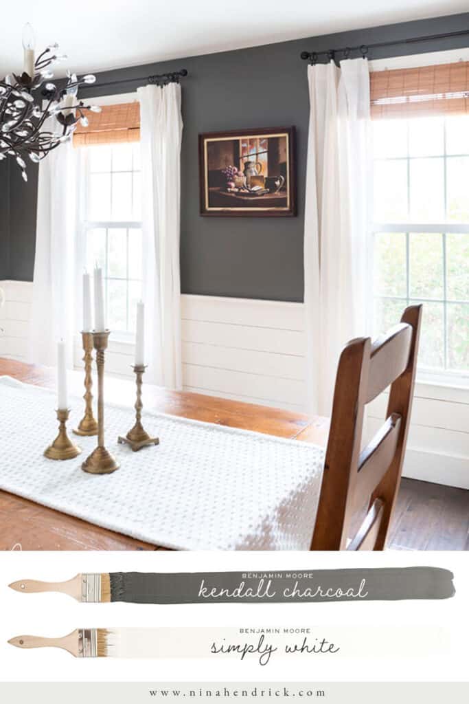
6. Benjamin Moore Kendall Charcoal HC-166
LRV: 12.96
Out of all the colors on this list, Kendall Charcoal doesn’t really have a detectable undertone. It’s the perfect contrasting neutral.
I use Kendall Charcoal as the primary “dark” anywhere I’m trying to make a statement, like the insides of exterior doors. I always recommend having a favorite light and dark paint color and keeping everything else in the middle.
After fighting with the harsh shadows in our Dining Room for years, I finally went back to the drawing board and gave the upper walls a couple of coats of Kendall Charcoal. I love the contrast it brings to this room and in some ways, it’s even brighter than it was before!
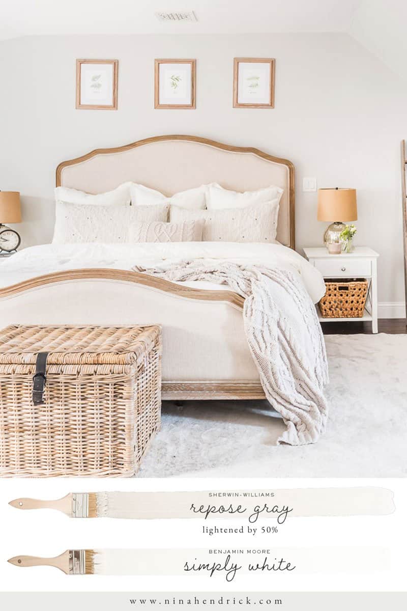
7. Sherwin-Williams Repose Gray SW7015 Lightened by 50%
LRV: Approx. 68 After Lightening
As you’ve probably noticed, I’ve mainly stuck with Benjamin Moore colors in my house. The simple reason is that there’s an awesome Benjamin Moore store right down the road from me (shout out to Mike, who has helped me with several paint product choices!).
With that being said, Sherwin-Williams also has great colors. A recent collaboration introduced me to Repose Gray. I lightened it 50% for our Primary Bedroom Renovation since we removed a north-facing window and the Wickham Gray was no longer working.
Oh, boy. I LOVE this color. I’m not sure what it means for the future of our paint colors, but it’s something to make note of.
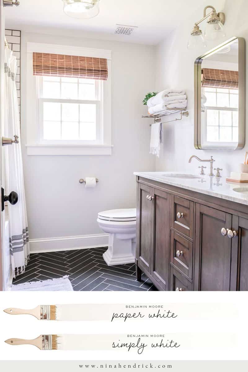
8. Benjamin Moore Paper White OC-55
LRV: 75.89
In the kids’/guest bathroom, I really wanted a lighter gray with blue undertones. I thought about lightening Gray Owl by 50% to raise the LRV, but the same concept is already neatly packaged in a proven color: Paper White! Paper White is a white-gray with ever-so-slight blue and green undertones. I loved it so much, I also painted our primary bathroom this color. I’m going to go ahead and declare Benjamin Moore Paper White the perfect bathroom color, because it looks so great with classic Carrara marble!
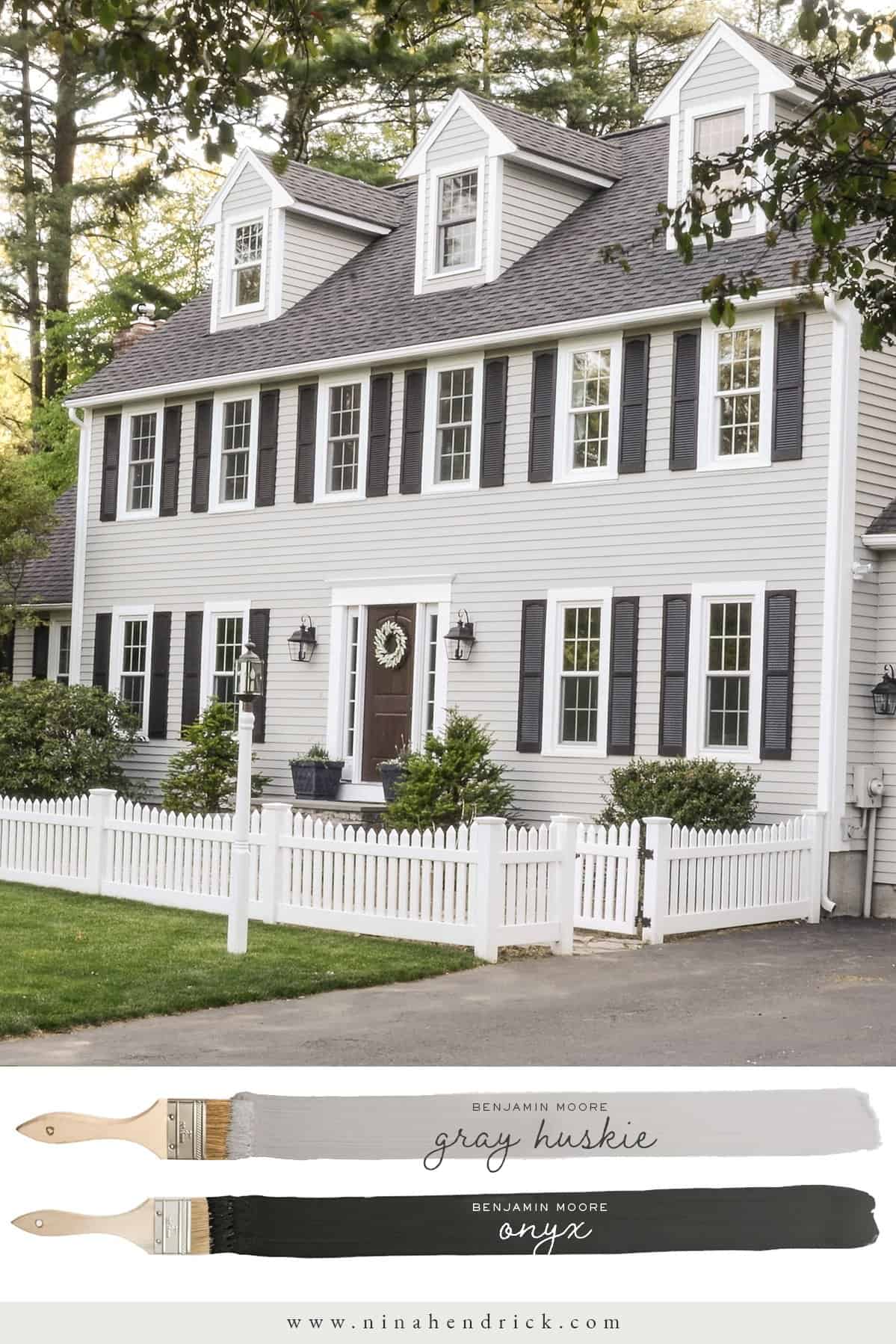
9. Benjamin Moore Gray Huskie 1473
LRV: 45.83
I went into detail about how I chose to paint our exterior Gray Huskie back in 2016. I still stand by this color as a gorgeous neutral exterior paint color choice that fits in so well with the rest of the color palette. Sadly, we had to replace all of our siding in 2019 because of a continuation of the water damage and rot that led us to repaint the exterior in the first place. I haven’t shared the full project yet, but it involved performance vinyl siding instead of paint, and I’ll explain more in a future post.
One thing I learned about exterior paint colors is that they always look much darker on a paint chip then they’ll look in full light. Also, the undertones will look different depending on the time of day. I would have never known looking at the paint chip that Gray Huskie had undertones of blue and purple!
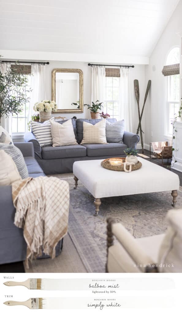
10. Benjamin Moore Balboa Mist OC-27 Lightened by 50%
LRV: 67.37
When it came time to makeover our living room, I was ready for a change. While I still loved the Edgecomb Gray on a bright and sunny day, I was craving something with a higher LRV for when it was gray and cloudy (a.k.a. three-quarters of our New England year).
Edgecomb Gray was introduced as a refreshed update of Revere Pewter. I’m going to go ahead and say Balboa Mist feels to me like a refreshed Edgecomb Gray. It’s a bit lighter, and while it still has a warm undertone, it’s more of a subtle purple. Overall, it’s a very clean color.
To get it exactly where I wanted it in our home, I lightened it by an additional 50%. The resulting color was an almost-white that was just spot on for this space.
One I Retired: Benjamin Moore Cloud White OC-130
LRV: 87.35
While there’s nothing at all wrong with the color, when we renovated our family room, I decided to go with Simply White for the trim and built-ins for the sake of simplicity.
I originally found Cloud White for my office to match the off-white IKEA cabinets that we’ve since replaced. Then, I used it in the family room because I wanted a creamier white to complement the off-white slipcovers and I conveniently had the leftover paint from the office. I’ll be swapping the slipcovers out during the family room refresh for gray (stay tuned for more on that decision) so it’s no longer a factor.
It’s still a great option I recommend for a creamier white paint!
All in all, if you’re considering adding a new color to your home, neutral paint colors are a great option! From warm beiges to cool grays, you can create a range of styles from modern to traditional. Plus, you can easily update your look with accent colors or furniture whenever you like. With so many possibilities, it’s hard to choose the perfect color, but I hope this guide has helped you eliminate some of the guesswork! Let me know on Instagram if you decide to use any of these colors!
Take the Paint Color Quiz!
Pin It for Later | the best Neutral Paint Colors