- Decorating
- Painting
How to Choose a Whole House Color Palette
Demystify the process of choosing a paint color scheme by creating a whole house color palette. With the basics of color theory and lighting under your belt, your paint color palette acts as a money- and time-saving blueprint for decorating!
If you’re struggling to choose paint colors for your home’s interior, you are definitely not alone! Choosing one color can be hard enough, but for cohesive decor, it’s really important to develop a whole house color palette. It’s a big job to choose all the colors at once, but doing so ensures that every room flows nicely, and you won’t be stuck with any clashes between your paint color and your existing finishes.
Overwhelmed? I’m here to help! I’ve guided dozens of people in choosing home paint color schemes with my online Color Story Course.
But if you’re more of a DIY’er, you can absolutely develop your own whole house paint scheme. Here’s everything you need to know to understand how color works on a technical level so you can choose the perfect colors for your home.
This post contains affiliate links, which means I may get a small commission (at no extra cost to you) if you shop my link. Please see my disclosure if you’d like more info!
How to Create a Whole House Color Palette
A whole house color palette isn’t just about wall paint—though that’s a huge part of it. It also includes accent colors that guide you while choosing the decor, the finishes for things like wood furniture, and the floors, stone, and metal. Think of it as a complete blueprint of the right colors for making all your decorating choices.
Why Choose a Whole House Color Palette Ahead of Time?
- It acts as a go-to guide for choosing any furniture or decor for your home, which eliminates some of the guesswork.
- You can save money and time by choosing the correct items the first time.
- All of this adds up to less chaos and stress.
So, yes! You need a whole house color scheme. Without further ado, let’s jump in.
How to Choose a Whole House Color Palette Step-by-Step
1. Set Your Intentions
It’s difficult to know where you’re going without a map to get there! I recommend doing at least a quick brainstorm to determine the mood and atmosphere you’re trying to achieve for yourself, your family, and your guests. This is the foundation of your color palette.
To get the ideas flowing, ask yourself about your current colors:
- Are they too dark?
- Too bright?
- Do they feel “dirty” or “dingy”?
- Do your colors fit your decorating style?

Note from Nina: Haven’t figured out your style yet? Start here!
After determining what you don’t like, make a list of what you would like the mood of your home to feel like. Here are some ideas:
- Calm and relaxing
- A space of warmth and welcome
- Neutral with fun pops of color
If you’re having trouble putting those ideas into words, consider making a mood board as a visual brainstorm of what you want to achieve.
Now that you have an idea of what you want your house to feel like, you have to figure out what type of colors it will take to get there. Color psychology is fairly complex and largely subjective, so I’m not going to go into that topic. Instead, we’re going to explore how color theory and color relationships work to create the mood you’re going for.
2. Understand Color Theory Basics
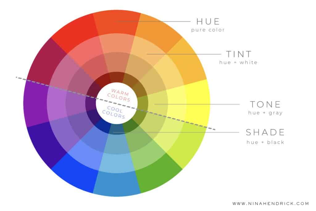
The color wheel above can do many things, but it’s essentially a tool that helps us by providing a visual representation of colors that will work together.
One thing that the color wheel highlights are color temperatures, which also touch a bit on mood:
- Warm Colors: Hues red through yellow, which includes most browns, beiges, and tans. Warm colors are active and stimulating. They are especially good at making items pop.
- Cool Colors: Hues green through purple, including most grays. Cool colors recede or fade, so they make rooms feel bigger. These colors are cool and relaxing.
Color Schemes/Relationships
You can also use the color wheel to visualize how colors are related to each other, which helps you decide which colors will work well together in a paint color palette. Here are some of the basics.
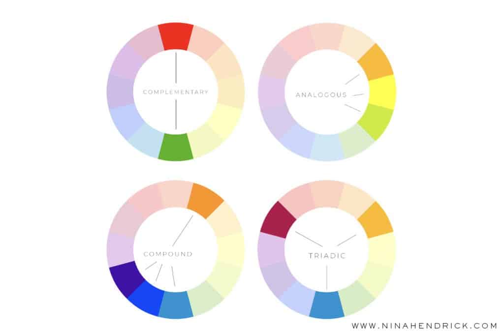
Monochromatic Color Scheme
One color from the color wheel is repeated in various shades (darker versions of the color) and tints (lighter versions of the color). You can have just one paint color repeated through your home in different shades for a very easy, restful color palette. To do this, simply choose one paint card with colors ranging from light to dark, and go from there.
Complementary Color Scheme
This scheme uses opposite hues on the color wheel. It’s best in complementary color schemes to allow one color to be more dominant, while the other color provides pops of interest. You can also use the undertones in neutrals to create a complementary color scheme—for example, a warm cream has yellow undertones that will complement blue. This color scheme provides a perfect balance to maximize contrast and project stability.
Analogous Color Scheme
Three colors that lie next to each other on the color wheel—for example, green, aqua, and blue. For balance in interior colors, a good rule is to consider 60-30-10. That is, make 60% of your room one color (usually the middle one on the wheel), while two other colors make up 30% and 10% of decor as accents. When using more neutral tints, this rule will bring you very close to a monochromatic color scheme.
Compound Color Scheme
Also known as a split-complementary color scheme, this is a combination of complementary and analogous color schemes. It takes opposite colors, but then it also gives you two additional colors that are right beside the main color. For example, red and green are opposites, but you can also add aqua and spring green (the colors that surround green) for additional interest and depth.
This color scheme is at its best when you use your base color as the dominant hue in the room. Instead of choosing a full hue, try to focus on a color for your base that is more on the neutral side, such as a pinkish-tan. Then, if you choose, you can go bolder with the other colors in the scheme.
Triadic Color Scheme
This color scheme utilizes three colors that are evenly spaced around the color wheel as every fourth color. The classic example is red, yellow, and blue, this scheme can also get much more sophisticated. It’s recommended when using a triadic color scheme that you choose one color to dominate, then use the others more sparingly to complement the main color. In interiors, this is a very bold choice as the colors will be high contrast.
Applying Color Theory to Create a Whole House Color Palette
I know this is a lot of information! You can use these ideas in two ways. If you’re starting fresh with a full renovation or new build, choose one of the color schemes from above with the mood in mind and pick your colors accordingly. More likely, you have some colors already in the existing finishes of your home. In that case, you’ll want to choose colors that complement them or tone them down to achieve your desired mood based on color relationships.
3. Consider Your Fixed Finishes
Fixed finishes are the things you’re already working with, such as wood floors, cabinets, and large pieces of investment furniture. Based on the color relationships above, determine where your fixed finishes fit into your favored whole house color palette and choose the rest of your colors accordingly. For example, your floors are probably the biggest fixed finish in any given room. That means the color of the tile or the undertone in the hardwood (is it orange-y pumpkin pine or a cool, neutral grey?) is automatically part of your color scheme, and you should consider its spot on the color wheel as you work to build your whole house color palette.
If you’re working with a neutral palette, you’ll want to look for the undertone of the color to determine where it fits into a color relationship. A quick strategy for this is to look at the paint chip and see whether the undertone of the color becomes obvious in the darker shades. A “white color” at the top of a paint chip isn’t very white at all when you get to the darkest shade at the bottom!
Additionally, you can run the neutral color around the color wheel. An undertone will become more obvious in comparison to both the pure hue of that color and the complementary opposite of that color. It’s pretty fun to test out!
4. Find Inspiration
Your next step is to gather examples of your favorite colors. (Notice that I don’t recommend this as a first step, because I don’t want you to become fixated on a color that’s all wrong in the grand scheme of your whole home color palette.) Blog posts and Pinterest may seem like obvious sources of inspiration for such a thing. However, you should also look at some of the favorite things you’re drawn to. Martha Stewart famously designed a beautiful line of paint colors inspired by the colors of her Araucana eggs, her dog’s fur, and antique bowls. Take note if something catches your eye and fits with your color scheme. There’s probably a color out there that’s close—or you can color-match it at the paint store.
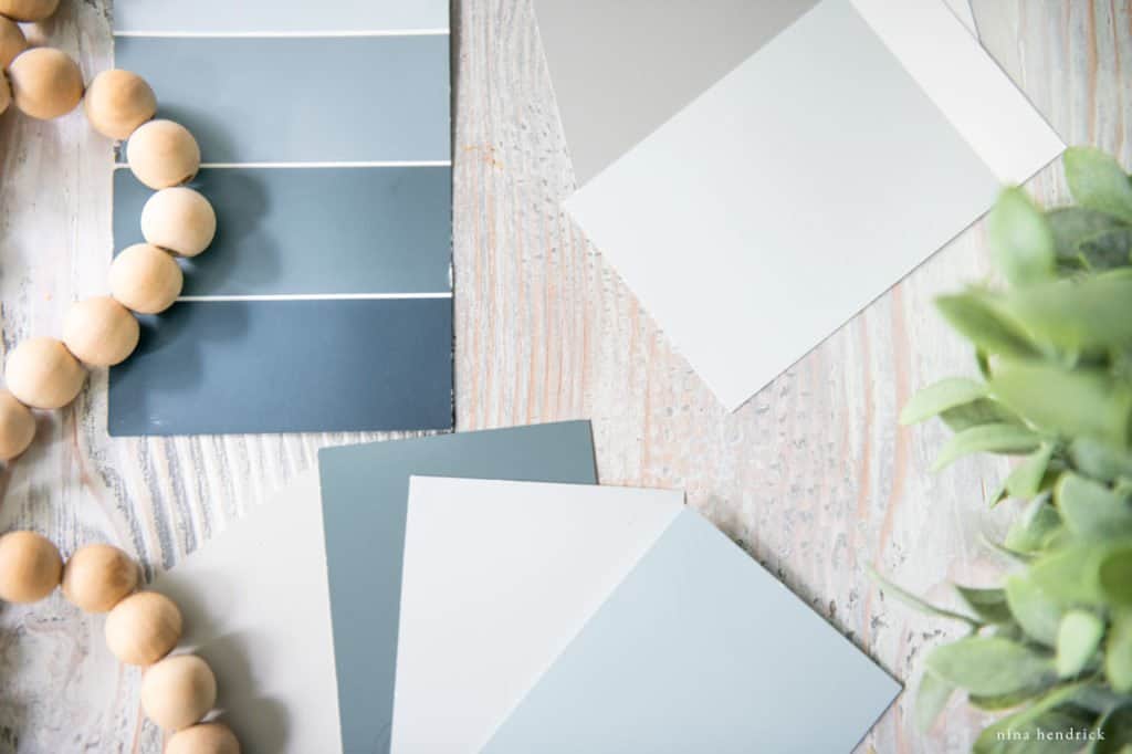
Keep in mind, though, that paint colors won’t necessarily look the same in your home as they do in the photographs. There are several factors that go into choosing paint colors. It’s always important to create color swatches before you paint! However, if you do want to check out some great colors to test out, I shared my favorite neutrals here.
5. Test Your Lighting with Large Color Swatches
Lighting and how it impacts paint colors is another complex topic. There are many factors, such as determining which compass direction the room faces and how colors respond to daylight accordingly.
However, what you mostly need to know is how the colors you’ve chosen as inspiration respond to the light in your specific room.
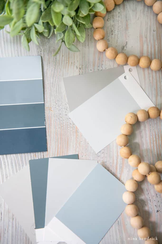
You can purchase peel-and-stick color samples of most popular paint colors from Benjamin Moore and Sherwin-Williams. If you’d rather DIY, I recommend painting a large piece of poster board with a sample of your color, hanging it up, and living with it for a while. I especially recommend this if you’re experimenting with paint sheens other than eggshell, since those are the only peel-and-stick samples available.
Observe how it responds to different times of day, different weather, and natural versus artificial light. You can also see how it plays with the finishes of the room in those situations. Does a color you thought was neutral actually have blue undertones? Green undertones? With the test, you adjust as needed until you’re perfectly satisfied.
6. Choose Your Whole House Color Palette
Now you have a pretty solid idea of which colors are going to work and where you’re headed. You’re ready to finalize your whole house color palette! Keep these final tips in mind to get you over the finish line.
Main Colors
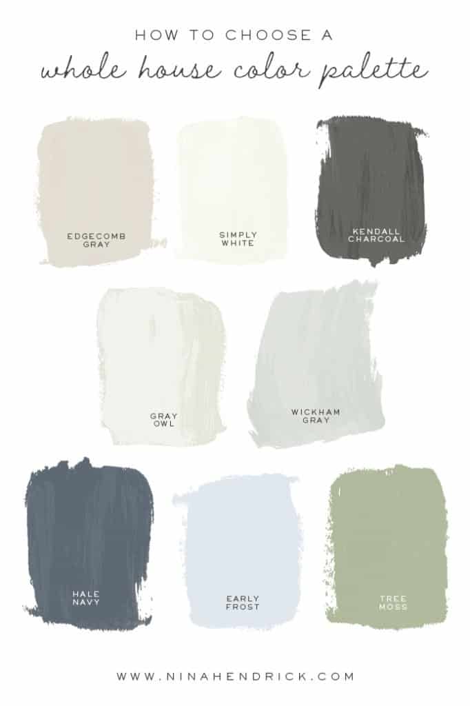
Out of the three to five main colors in your interior paint color scheme, at least one should be neutral, one should be a white, and one should be a darker, contrasting color. For the remaining two, it’s up to you! My personal preference is to stick with neutrals for my main colors and go bolder with my accent colors.
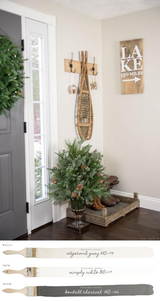
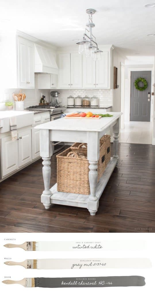
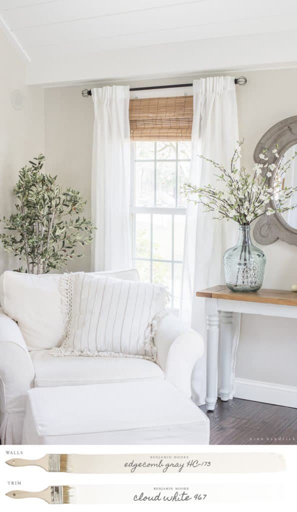
For example, in our previous home, my main neutral was Benjamin Moore Edgecomb Gray (a warm greige), my main white was BM Simply White, and my darker contrasting color was BM Kendall Charcoal (a charcoal gray).
In our new home, I chose a white paint color as my main neutral and for trim: Benjamin Moore White Dove.
Accent Colors
These are the colors that you will use throughout your home in your more changeable finishes, such as throw pillows and other smaller accessories. You will usually use up to two of these accent colors in a single room—three would be the absolute maximum.
Wood Finishes
One or more of these may have already been determined by your fixed finishes. You will want to choose one or two more, depending on whether you have bought all of your furniture yet.
Stone Finishes
These may be countertops, tile floors, or a brick fireplace. Again, these may already be determined as fixed finishes, in which case you’ll need to work with them, not against them!
Metal Finishes
Like any other finish in your home, metals have undertones. Gold, brass, bronze, and brushed nickel are warmer. Chrome and silver are cool. Black is neutral. You will want to use one or two in a single room of contrasting undertones. You can read my guide for mixing metals here!
Now, put it into action!
Yay, you did it! Well, you read through this novel of a post, at least. Chances are good that implementing the things you just learned will take a bit more time. That’s completely understandable! Take as much time as you need with this, and don’t be afraid to get things wrong and make changes as you go. That’s why it’s smart to take the time to build a mood board and test those paint samples before you finalize your paint scheme.
Are you ready to paint? You can read here about my favorite process for painting a room, the tools I love to use, and how we transformed our bedroom with paint.
Free Quiz — What’s Your Paint Color Personality
One last thing! If you’re still not sure where to start, you can get some insight into your personality and mood preferences with this fun paint quiz.
Let me know on Instagram when you put together your whole house color palette—I can’t wait to see it!
